Client: George Gorringe
Role: Conceptualisation, Brand Identity, UI
Year: 2023

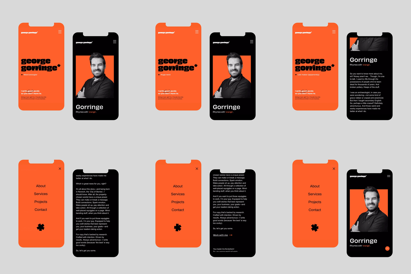
George Gorringe is a copy and content writer who believes in the power of words to shape big ideas, take the reader on an adventure and bring a bit of fun into the world. He also wanted to attract clients looking for copy done a little differently—the best messages are, after all, often the boldest and take a little risk.

To establish George’s brand concept, we took inspiration from his past work as an archaeologist, his playful and adventurous nature, grasp of grammar and punctuation—and the fact that his last name conveniently rhymes with ‘orange’.

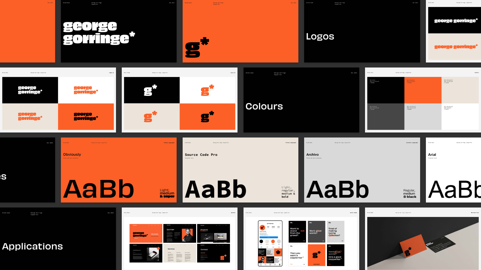
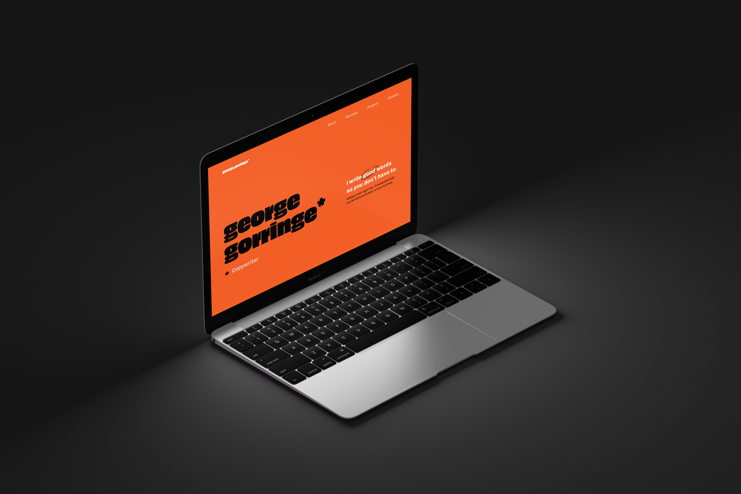
Combining these elements, we created a brand that reflects George’s personality and style, establishing a vibrant orange as his primary colour and incorporating stark contrasts to make every look pop.

Similarly, his typography is simple, yet striking, making use of the aptly named font, ‘Obviously’ to craft a logo that also incorporates a subtle archaeological easter egg. Finally, we played with punctuation (the asterisk, in particular) and illustrated elements to give his brand an organic, edited feel—opening the doors for some visual gags, too. to see their true selves in his frame. This concept is carefully presented in the brand’s logo and assets.

The result: a bright, bold and eye-catching brand reflecting George’s written and personal style—letting his clients know exactly what they’re getting into! 

TESTIMONIAL

  • I’ve worked with Sara on many projects, but seeing her process applied to my own brand was truly something special. Sara is dedicated, meticulous, thoughtful, creative, intentional—and a long list of other fantastic adjectives! She perfectly captured in design what I try to convey through words, and I couldn’t be happier with the final result. To work with Sara is to work with a genuine artist.

Previous
Previous

Lucía Rodrigo

Next
Next

Wipu app